Client
Personal Project

Overview
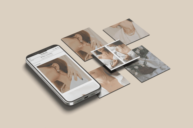
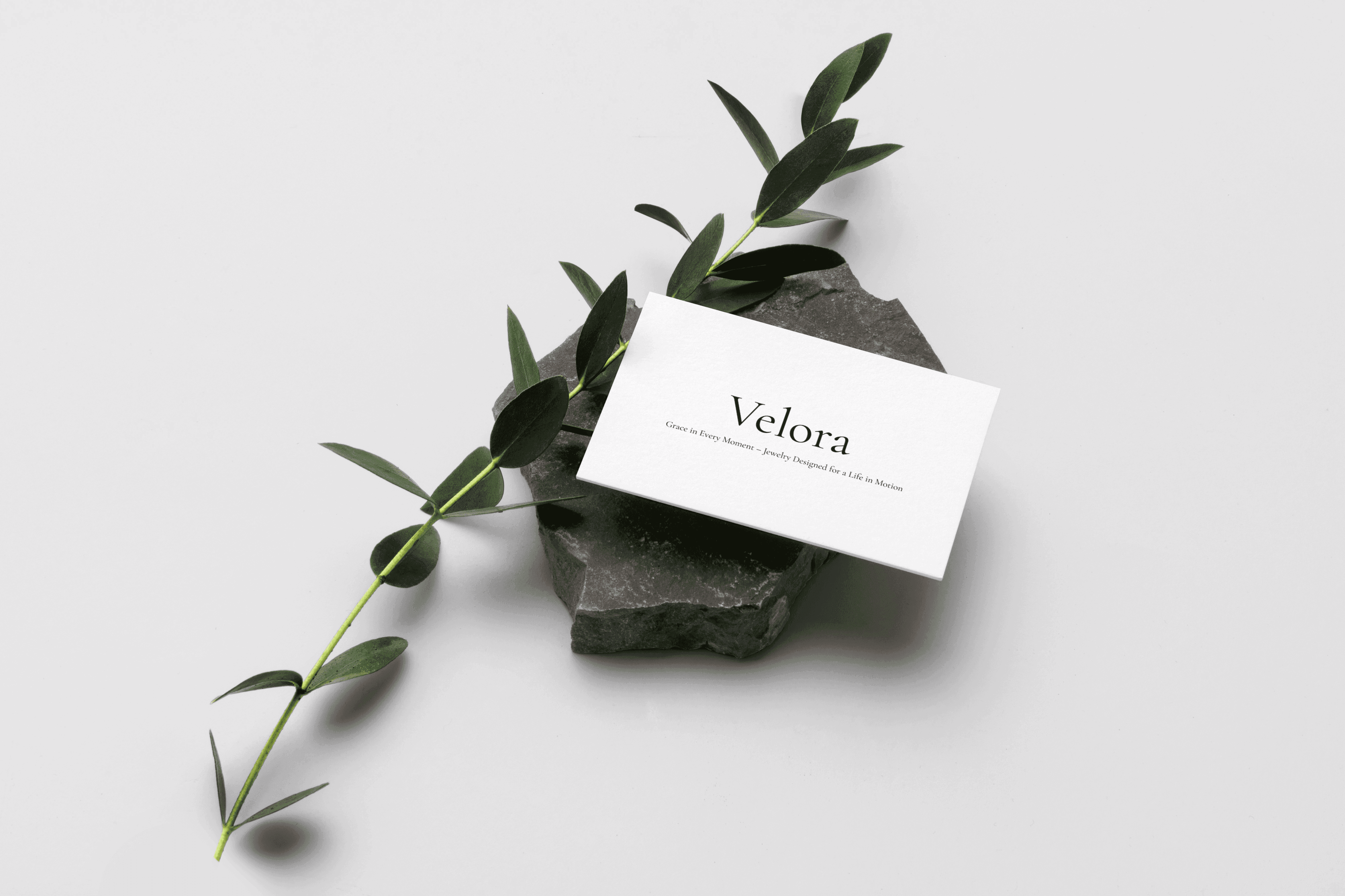
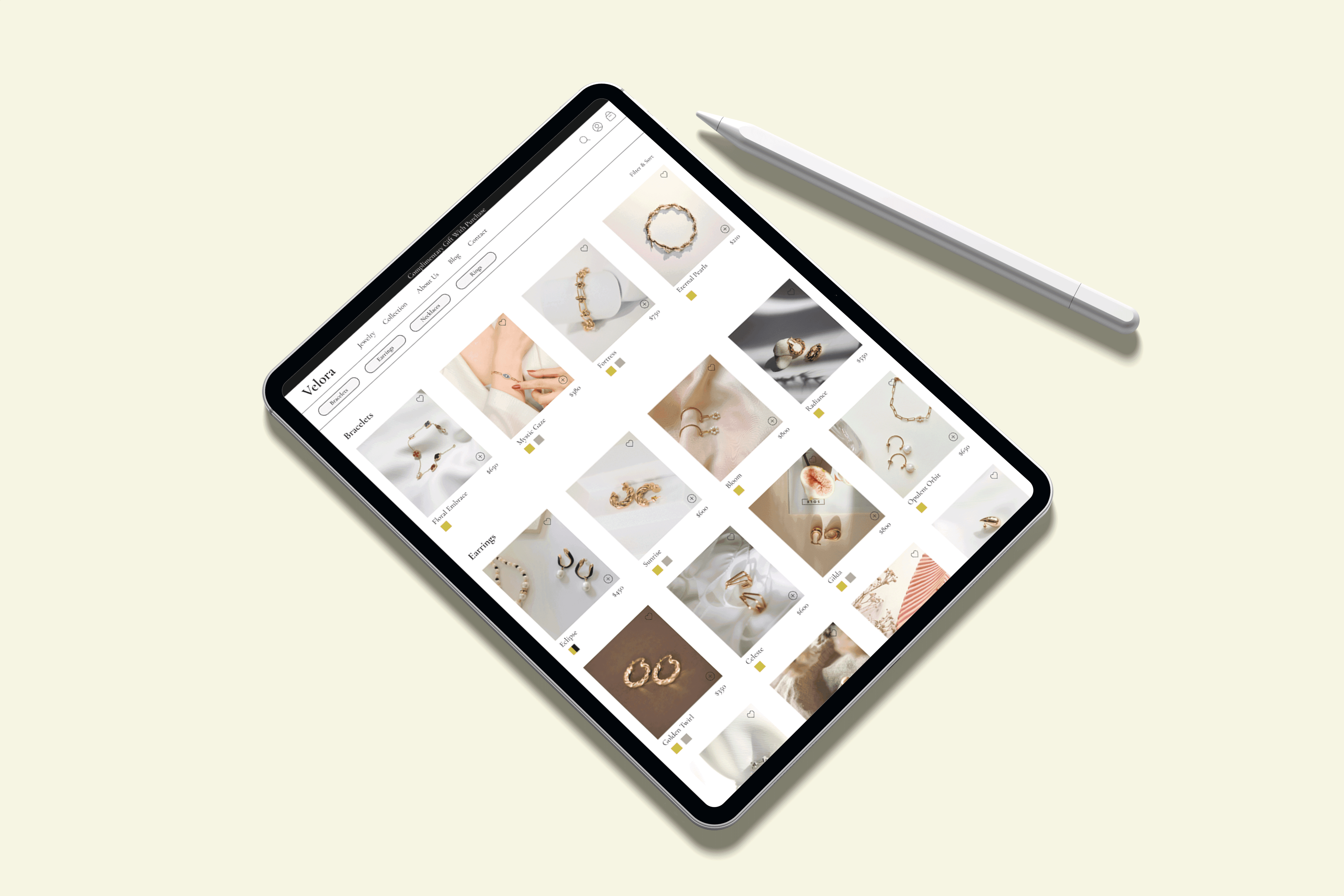
Velora is a luxury jewelry brand designed for busy working women who appreciate minimalist, high-quality, everyday jewelry. Velora's website showcases collections in a visually engaging format, similar to flipping through a photo book, with an emphasis on the artistry and elegance of each piece rather than a traditional shopping experience. To create a seamless, sophisticated browsing experience that reflects the simplicity, while offering a space for users to explore and appreciate the collections at their own pace.
Client
Personal Project
Industry
Fashion
Service
UI/UX Design
Digital Design
Duration
4 Weeks

The Challenge
Most luxury jewelry websites emphasize direct sales and transactions, which can feel impersonal and rushed. However, busy, career-focused women often seek a more relaxed, visually engaging way to explore jewelry collections without the pressure to buy immediately.
The Goal
The primary goal of designing Velora, a luxury jewelry brand is to showcases collections through a minimalist, elegant aesthetic. The challenge was to create an experience that prioritizes visual storytelling, offering an inviting, easy-to-navigate platform for browsing jewelry collections without the pressure to purchase.
The Solution
Velora’s website creates a seamless, sophisticated browsing experience that prioritizes visual storytelling and elegant design. It offers an easy-to-navigate, minimalist interface where users can explore collections at their own pace, appreciating the craftsmanship and beauty of each piece.
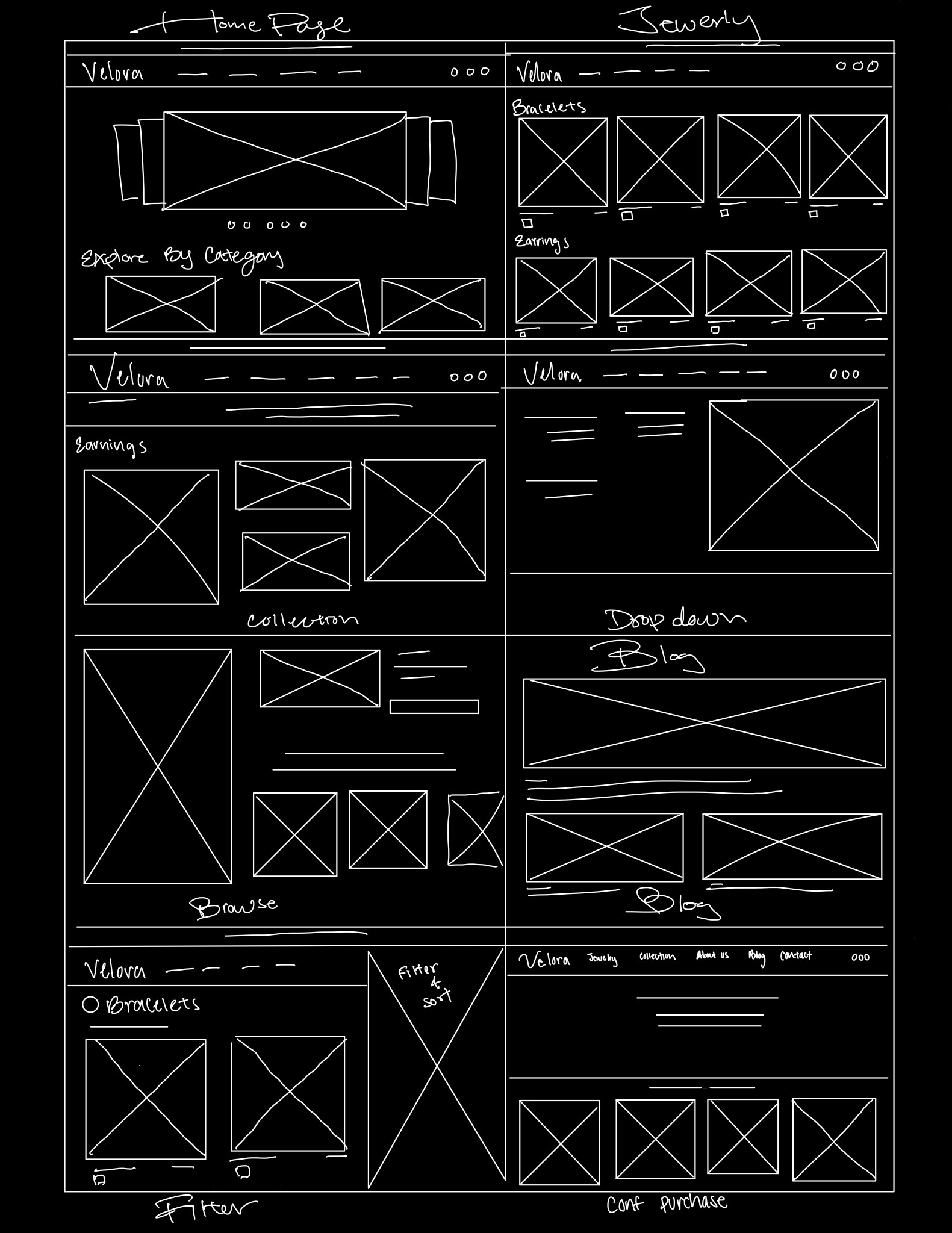
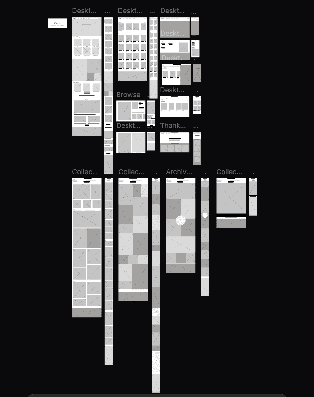
Design Process
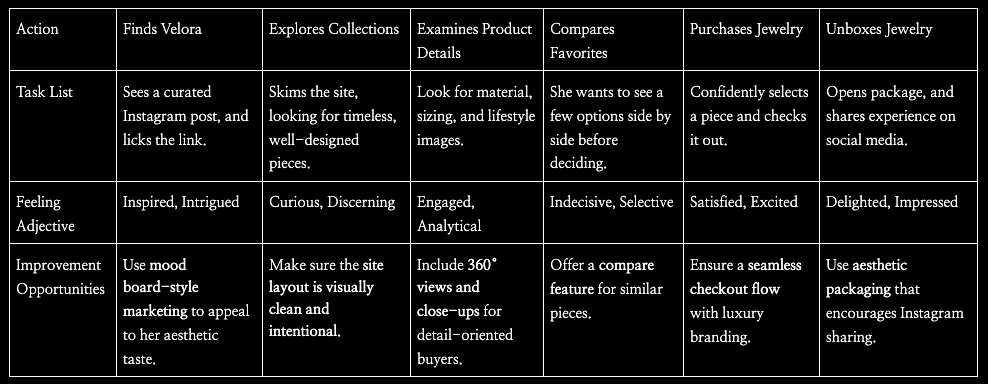
1. Empathize a. Conduct user research b. Analyze common pain points 2. Define a. Target Persona b. Empathy Map 3. Ideate a. Brainstorm potential features b. Task Flow 4. Prototype a. Paper & digital wireframe b. Low & high fidelity prototype 5. Test a. Conduct usability testing b. Interate user insights to enhance accessibility
User Research: Summary
I gathered insights from busy, career-focused women who value time efficiency and a seamless, aesthetic experience. They prefer browsing jewelry without feeling rushed and are drawn to platforms that prioritize visual storytelling over a transactional shopping experience. Users also wants multiple pieces in the same collection and a curated, elegant layout that highlights craftsmanship without overwhelming them with choices.
Pain Points
1. Lack of Visual Engagement - Users reported that traditional jewelry websites often lack the aesthetic appeal and storytelling element, making it hard to fully appreciate the design and craftsmanship of the jewelry. 2. Difficulty in Browsing Collections - Existing jewelry websites often focus too much on product listings, making it hard for users to enjoy the experience of browsing curated collections in an elegant and fluid way. 3. Desire for Visual Storytelling - Users want the website experience to feel more like browsing a curated photo book than simply a product catalog. They value rich, immersive visual content that helps them emotionally connect with the collections rather than just focusing on price tags. 4. Preference for Minimalist Design - Busy women prefer websites with clean, minimalist designs that don’t overwhelm their senses. They want a layout that prioritizes ease of use, showcasing products in a straightforward, elegant way without clutter.


Usability Study: Findings
1. Wishlist Feature - Users didn’t immediately notice the Wishlist feature, reducing their ability to save pieces for later. 2. Filtering Feature - Users wanted to filter by jewelry type (rings, necklaces) but had to scroll through everything. 3. Landing Page - The highlight section on the landing page is unclear, as there is no text to explain the purpose of the images.


Accessibility Consideration
1. Ensured images are large enough for users to easily view details, especially for those with low vision or other visual impairments. 2. Used an easy to read font: Cormorant Garamond for better readability. 3. Allow users to dilter product reviews for specific attributes such as size, quality, or customer satisfaction.
The Result
The result is an inviting, refined digital experience that aligns with Velora’s luxury and minimalist brand identity, allowing users to engage with jewelry collections in a meaningful, stress-free way while maintaining an air of exclusivity and sophistication.
Key Takeaway
1. Focused on visual storytelling, prioritized creating a visually engaging experience. 2. The site is ad-free to provide a clean, uninterrupted browsing expereince, allowing users to focus. 3. Aim to discover, Velora's design encourages exploration in offering more opportunites to discover and engage with the jewelry collection.
Next Steps
1. Include virtual try on to allow users to upload a photo or take one to envision how the jewlery would look on them in real time. 2. Add in personalized recommendations to sugest jewlery based on user preferences, browsing history, and previous selection to offer a currated shopping expereince. 3. Include lookbooks with styled jewlery of customer base to allow inspration from the community.